LEFT BANK BOOKS WEBSITE PROPSAL
An evaluation and proposal for primary navigation & organization/layout updates to an anarchist bookstore’s site based on a detailed research & design process.
PROJECT
+
BACKGROUND
+
PROJECT + BACKGROUND +
Left Bank Books [LBB] is an independently owned anarchist bookshop. Their site features unique services while preserving LBB's anti-establishment values. The site is not generating much foot traffic and they hope to update their site to create an enjoyable experience for their customers.
OVERVIEW
CLIENT WEBSITE
LINK
PROJECT ROLE
Researcher & Designer
UX/UI
PROJECT DURATION
Two Weeks
2022
EXISTING VS PROPOSED DESIGNS
CLIENT NEEDS
Left Bank Books is not your average bookstore, and they offer numerous unique activities on their website. As such, they wish to maintain their values at the focal point of their site design for their customers to understand them.
USER NEEDS
The client’s average user is categorized as a Careful Critic. This user focuses on the quality of the information the site provides. They like to read product descriptions & reviews and don't purchase goods without details.
EXISTING SITE:
LAYOUT & NAVIGATION
Here is a quick look at the current home page of Left Bank Books and primary navigation setup.
This video shows you how users interact with the existing website when they add books to their cart.
EXISTING SITE:
INVENTORY & DETAILS
My research began with a heuristic analysis & I saw that while there were successful elements, the navigation & layout of LBB's site required a deeper look. The business assessments that followed, showed me how I could start to solve these pain points.
RESEARCH SUMMARY
HEURISTIC EVALUATION HIGHLIGHTS
DISCOVER
+
DEFINE
+
DISCOVER + DEFINE +
-
After creating a map of LBB’s website and how they organize their bookstore, I determined the pain points of the primary navigation along with all the information architecture of the site.
-
In my first sort, I provided 20+ cards assigned with information from LBB's site. Users then created categories titles and allotted the labeled cards to one of the groups. These results told me what types of titles users would intuitively understand within navigation elements.
-
For the 2nd and 3rd card surrounds, I implemented hybrid sorting methods. I provided the labeled cards and category names before asking users to sort the labels and/or to create new categories to help me finalize category naming & information assortment.
HYBRID CARD SORT RESULTS: FINAL ROUND
CARD SORT AGREEMENT PRECENTAGES
-
Using Jacob Nielsen's Classic Heuristics as the standard for my evaluation, I combed through LBB’s existing site to highlight the areas that did & did not satisfy the needs of the users and business (seen above).
-
I completed a competitive analysis with other bookstore websites, like Barnes & Noble, to understand how design elements like page layout or primary navigation could be organized successfully in LBB's site.
-
The comparative analysis was where I studied how successful specific features - such as inventory landing pages - were implemented on commerce sites (Amazon & Birchbox) within an industry outside of bookstores.
I needed to map out the framework of Left Bank Books’ website to analyze its content. To gain user insight, I initiated 3 rounds of card sorting - or a form of research testing where users interact with and reorganize the information architecture of the site.
DISCOVERY & ANALYSIS
The critical shopper needs Left Bank Books site to be more organized in order to have a more informative & intuitive shopping experience.
PROBLEM STATEMENT
The card sort results allowed me to create a new site map for Left Bank Books while also simplifying the primary navigation by renaming the category titles for users' ease.
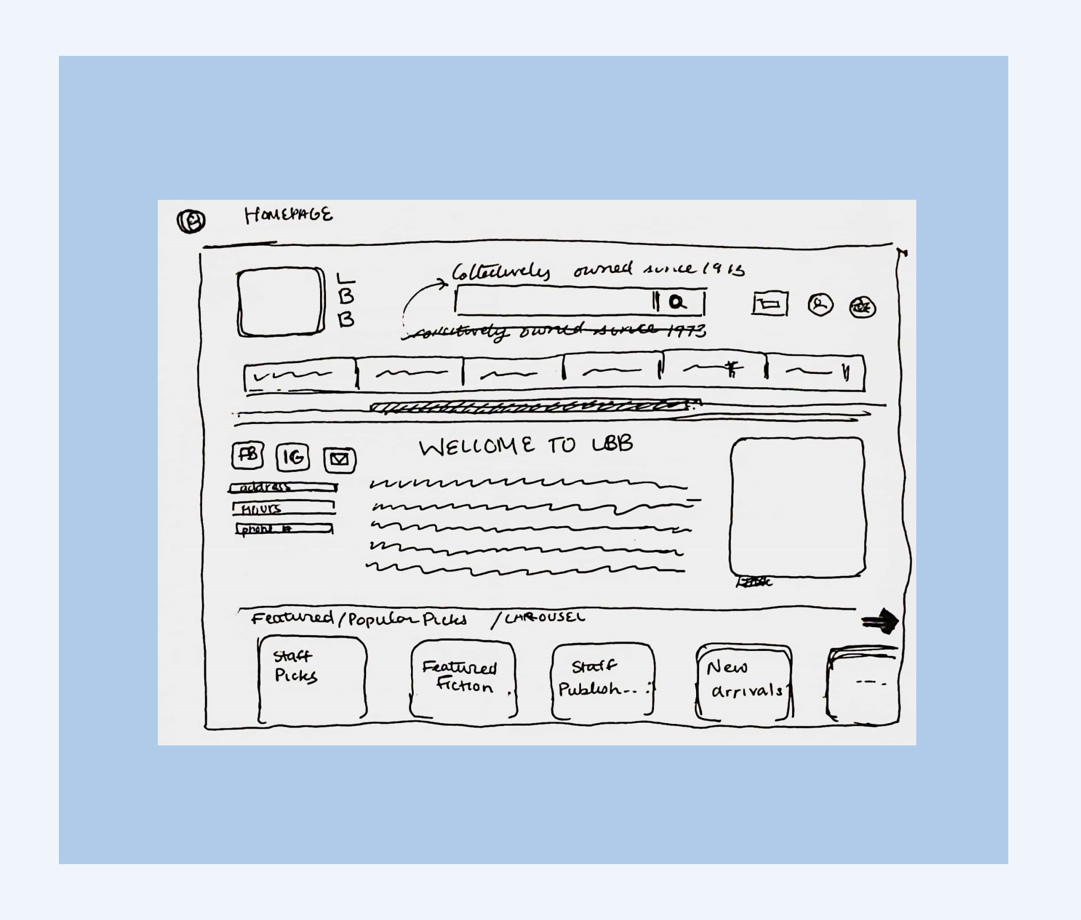
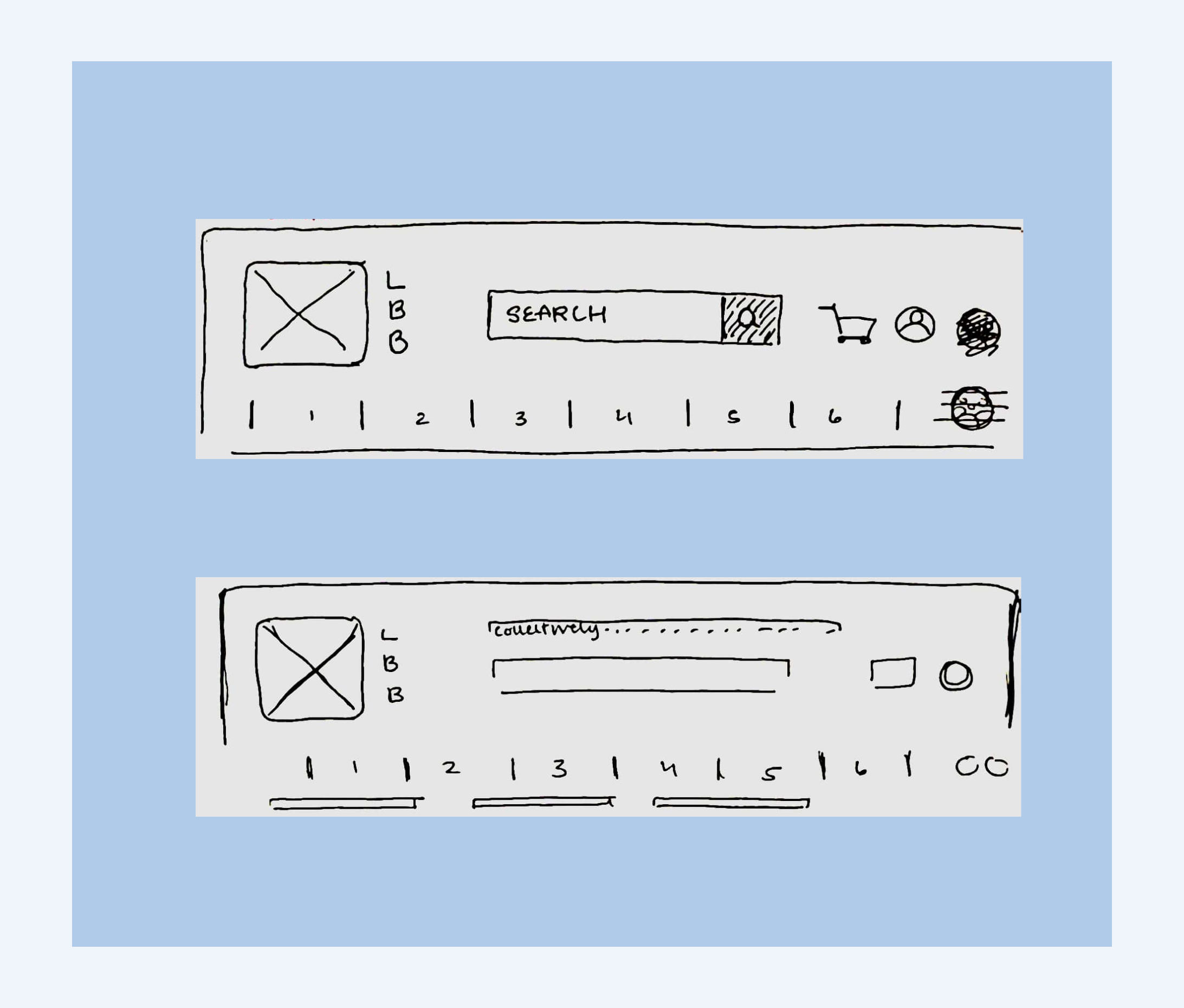
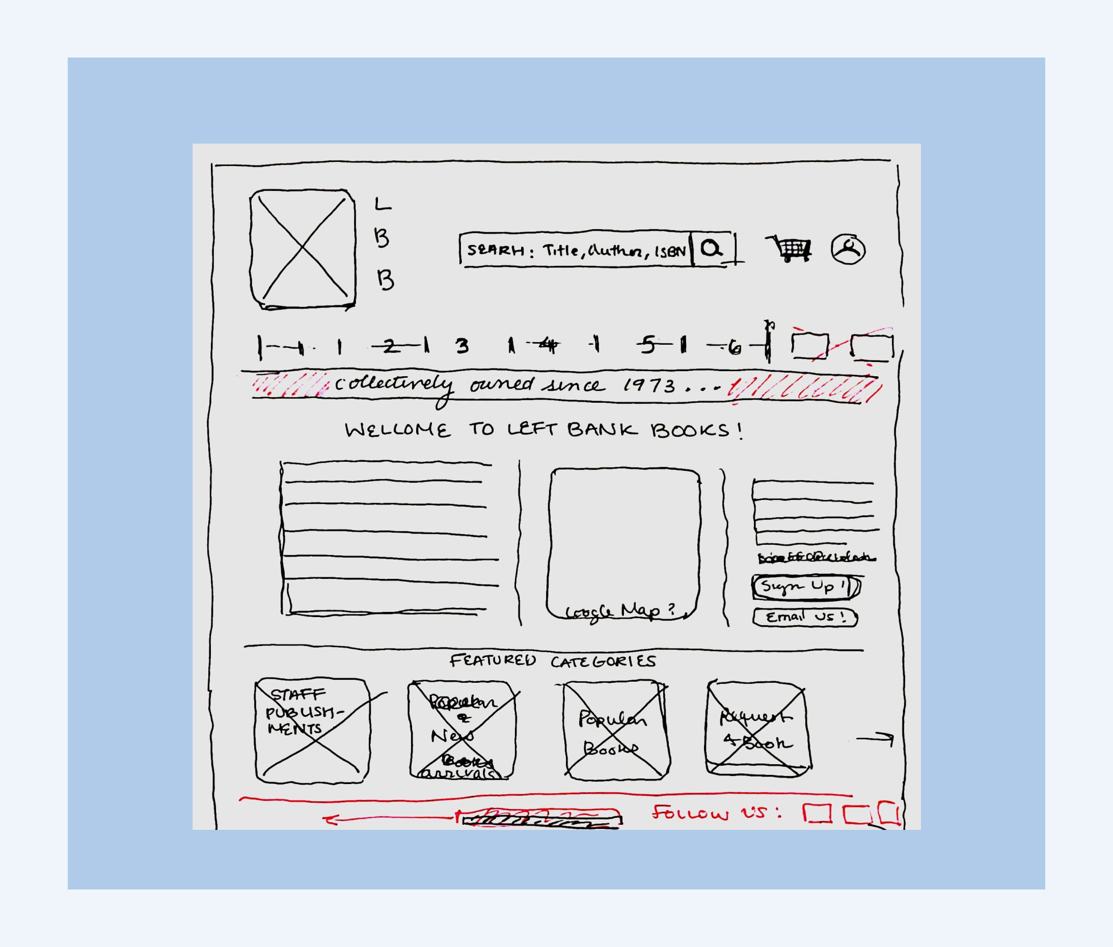
While ideating upon potential solutions for the client, I made sure to focus and sketch the main pain points of the current site; primary navigation & information layout.
DESIGN
+
DEVELOP
+
DESIGN + DEVELOP +
SKETCHING
DESIGN USABILITY TESTING
Once the initial prototype was complete, I asked 10 users to go through a task and add a book to their cart. After two rounds of iterating & testing my prototype, I developed new solutions to the problems that users faced in the tests.
After sketching out my ideas, I designed a format and layout to work off and constructed a high-fidelity wireframe & prototype to match my ideas.
The feedback from this round I provided me with the primary issues of my first iteration. While most of the new elements were successful, the lack of guided steps & labeling of a category made it hard for users to execute tasks smoothly.
After updating the navigation labeling & added guided details in the checkout process, my new design was very well-received by testers this time. This iteration and the user success rate improved a lot from the initial round and let me validate my designs.
ROUND ONE
ROUND TWO
UPDATED:
LAYOUT & NAVIGATION
Users can find their product in a more straightforward, detailed, and organized manner.
Here is a walkthrough of the home page in the final design that I came up with based on research & user feedback.
UPDATED:
INVENTORY & DETAILS
Within the time limit of this project, I completed one usability test that showed me where I could improve my design.
Once the project’s timeline was over, I returned to complete a second iteration & usability test of my Left Bank Books design. Ultimately, I created a dynamic solution to a unique bookstore's problem.
This project was a great learning experience for me & I learned about the structure of the UX process in detail. I understand how a detailed research process led to a well-informed design and also how it helps align user and client needs clearly .
-
Building out this function in the prototype would allow me to improve upon the user’s accessibility to books that are sold by LBB and the vast information that the site offers. Adding search filter features would be especially helpful to allow the user to narrow down their searches.
-
To allow users to save their preferences, searches, event details, and more personalized features to the site, I want to design a feature that allows users to sign in. This way, users would be remembered on the site & their information is stored in an easily retrievable location.
CONCLUSION
POSSIBLE ADDITIONAL FEAUTRES
WHAT I LEARNED
~
WHAT I LEARNED ~
THANK YOU FOR CHECKING OUT MY CASE STUDY!
If you would like to chat about my work, just reach out to me!


