AP-JIBE Website Design
First Principles Innovations [FPI] offers its clients in the Telecom and Healthcare businesses numerous ways of accessing, analyzing, and sorting multiple facets of data through their program AP-JIBE brownfield planner [AP-JIBE].
The CEO and COO of FPI are seeking to transition their AP-JIBE (brownfield planner) to a more convenient website format. This will allow users to access a simplified version of the planner and view information in a new and more accessible manner.
AP-Jibe website design focused on translating information from a client-based tool/program into a simplified website that displays the summaries of the outputs of the tool.
USER NEEDS
Users have the ability to visualize data outputs and summaries
Users have freedom to manage and sort through scenarios
Users can easily follow a straightforward + intuitive navigation
BACKGROUND
User should be able to access their project data and interact with their visual aspects on the website smoothly and efficiently through the following methods:
DISCOVER & DEFINE
The clients came with sketches of their initial onboarding ideas for the new website; so I focused on detailed questions for the client through interviews over general research on tools similar to APJIBE.
SCREENS BREAKDOWN
SCENARIO OVERVIEW:
Before moving on to sketching out my flow, I identified the most important interactions that users will need:
DETAILED BREAKDOWNS OF INFORMATION (+ HIDE OPTIONS)
SEARCH, SORT, FILTER, & COMPARE TYPE FUNCTIONS
GRAPHS, MAPS, KEYS/LEGENDS
I then created a user flow chart to identify a simple yet effective path users could navigate easily. This path then allowed me to identify the necessary screens + details for the prototype:
IDEATION
USER FLOW
LOGIN SCREEN:
SCENARIO SUMMARY:
FINANCIAL REPORT:
SCENARIO COMPARISON:
Header: consistent across the site
Primary Navigation: Finances, Operations, etc.
Scenario Title + Description
Maps + Filters Features
Scenario details, Simple activities, networks, Nodes, Etc.
Username + Password Login
FPI Logo
Site Name
Scenarios, categorized in a minimum of 2-3 columns
Header: Settings, User Account Access, Help Icon
Scenario comparison button/feature
Header, Primary Navigation: onsistent across the site
Information Tag
Simple Statistics, Graphs, Keys,
Filters + Summaries
Header, Primary Navigation: onsistent across the site
Information Tag
Simple Statistics, Graphs, Keys,
Filters + Summaries
DESIGN & DELIVER
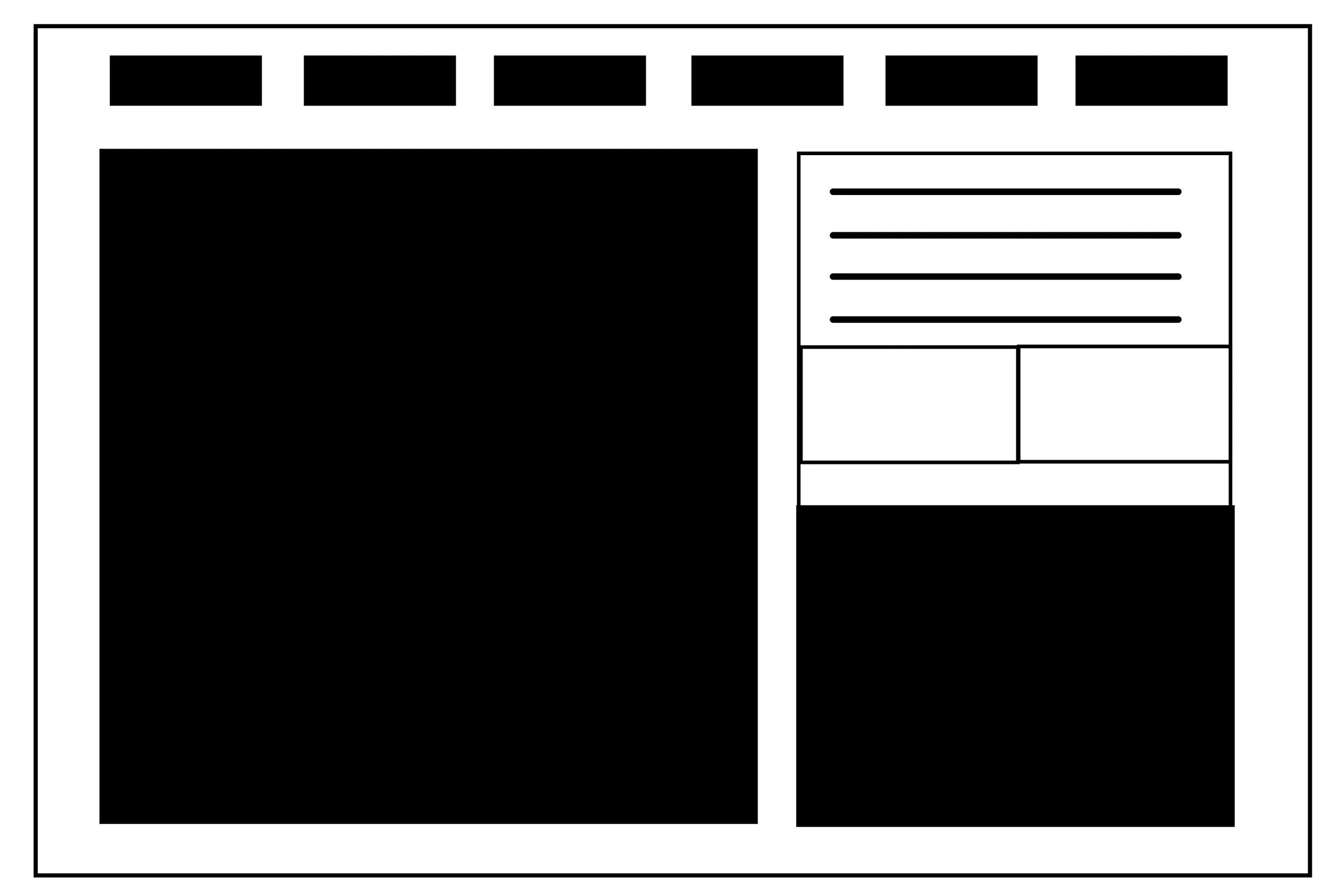
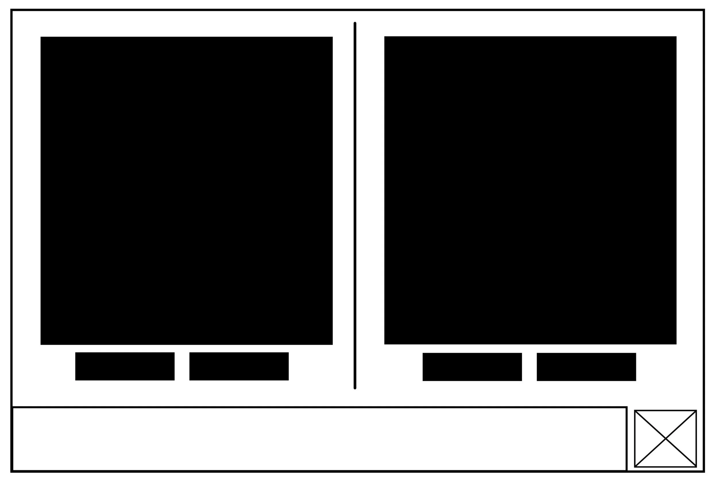
LOW FIDELITY SKETCHES
At the start of the project, the clients & I decided that due to the intricacies of the AP-JIBE program, the design that would be transitioned to their engineer/developer would be a low/mid-fidelity prototype & wireframe based on the user flow above.
Once I had the necessary research + information, I began sketching out numerous possible layouts for the different types of screens I had identified.
LOW/MID FIDELITY PROTOYPE
DUKE TECH SOLUTIONS UI KIT
These sketches helped me create a low/mid-fidelity prototype. After going through a few design iterations with FPI’s engineer, we were able to create a simple flow consisting of a login screen, a summary screen, and a few detailed components.
I also provided the client with a full UI kit of the final prototype.
CONCLUSION
Working closely with the owners and engineers gave me greater insight into a topic I had little previous knowledge of. Through research and information provided by the clients, I was able to successfully create a simple prototype flow of the type of website First Principles Innovations is hoping to transition its complex tool to.
CLIENT REVIEW
THANK YOU FOR CHECKING OUT MY PROJECT!
If you would like to chat about my work, just reach out to me!
Since this project was all about creating a new simplified design of a PC-based app/tool, I had to take a different approach to my process. Focusing heavily on research and understanding the client’s product was a big part of being able to translate their ideas into a clickable website prototype. Additionally, working together with their engineer also allowed me to help pick out which features are the most important to implement on their new simplified site.
"We brought Maya in to build a prototype for a browser-based interface to our existing client-server application. Maya attacked the project with youthful enthusiasm, she worked very independently while attentively communicating with the team and carefully listened to feedback… Maya could easily grasp the essence of what we needed to communicate, filter out the domain-specific noise, and focus on the important UX aspects."
Luc Absillis, COO of First Prinicples Innovaionsl, LLC.


